
Shippp is now in open beta
Shippp, the product design tool for the AI era, is open to everyone. Try it and tell us what works and what doesn't.
Boldi, Bence
Founders
AI has changed how products get built. Design, code and specs move faster than ever, but the one source of truth that used to hold a team together has practically disappeared.
Our goal is to build the best product design tool for this new era, and to make Shippp that source of truth again. Today Shippp enters open beta.
What open beta means
Shippp is ready to use, and it isn't finished. You can design real screens and a real design system, and export them as code. Some things will be rough, and some will change based on what you tell us.
We want to hear both kinds: what works well for you, and where you got stuck.
Tell us what you think
Every message gets read by the people who build Shippp. Tell us what slowed you down, what surprised you and what you expected to find. A short note is enough, and a screenshot helps.
Send your feedback to hello@shippp.ai.
What you can try today
Shippp is a canvas for designing products, with the design system right next to it. Here is where we'd like your eyes first.
The editor
The editor has four parts. The left panel holds your pages and layers, the canvas sits in the center, a toolbar runs along the bottom and the inspector on the right shows the properties of whatever you select. Select several layers and the inspector tells you that edits apply to all of them.
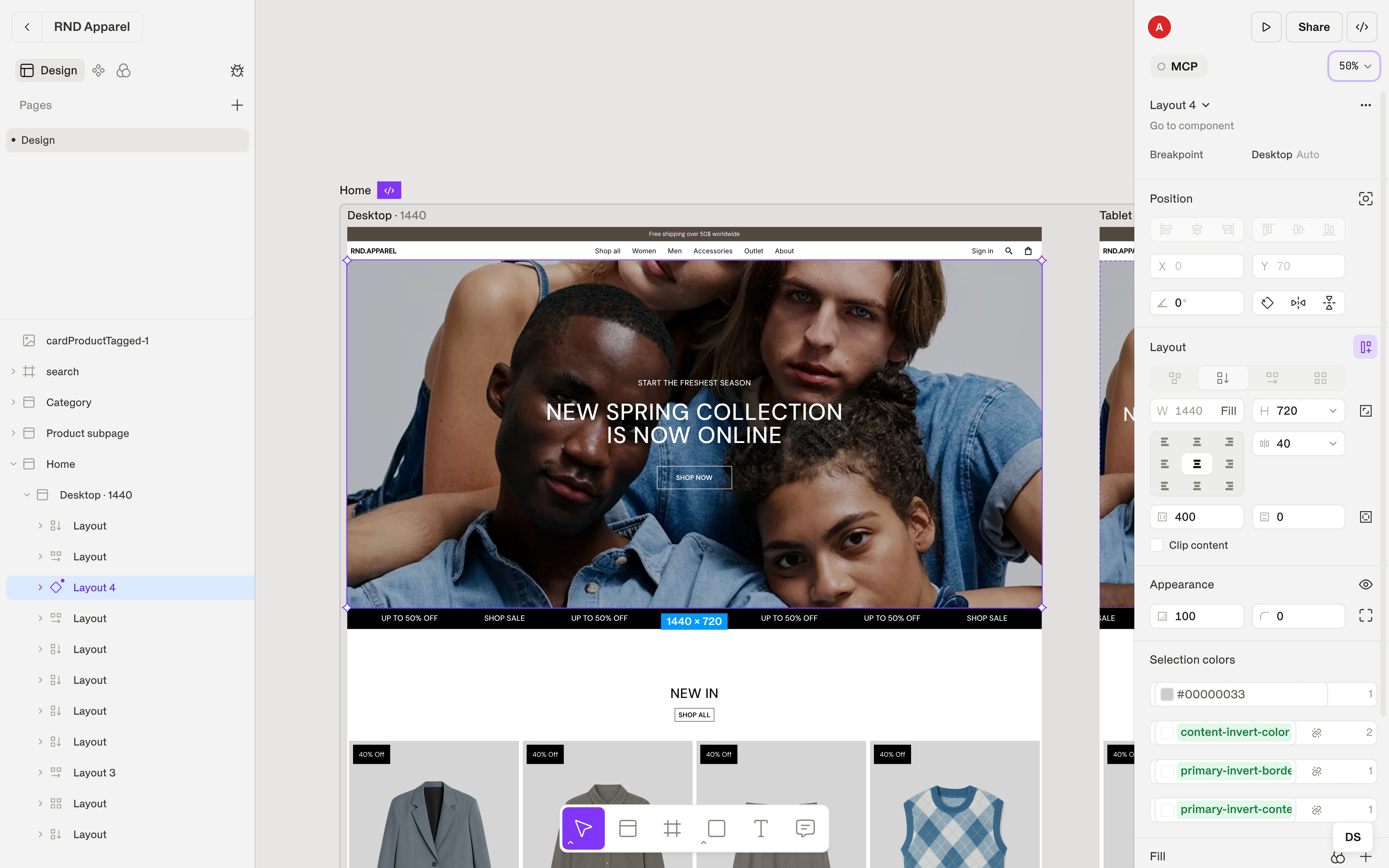
The left panel has three tabs: Design for pages and the layer tree, Components for your component library and Foundations for tokens, text styles, effects and breakpoints. Every tool has a single-key shortcut, such as V for the pointer, S for a screen, F for a container and T for text. Press ⌘ K to search pages, components, tokens and actions.
The editor also shows the state of your file in plain words, such as Connected — collaborating live or Offline — changes are saved locally.
The editorScreens and breakpoints
Press S and click on the canvas to add a screen. New screens start at 1440 × 900. A section groups the screens of one page, so you design one responsive page instead of a pile of separate artboards.
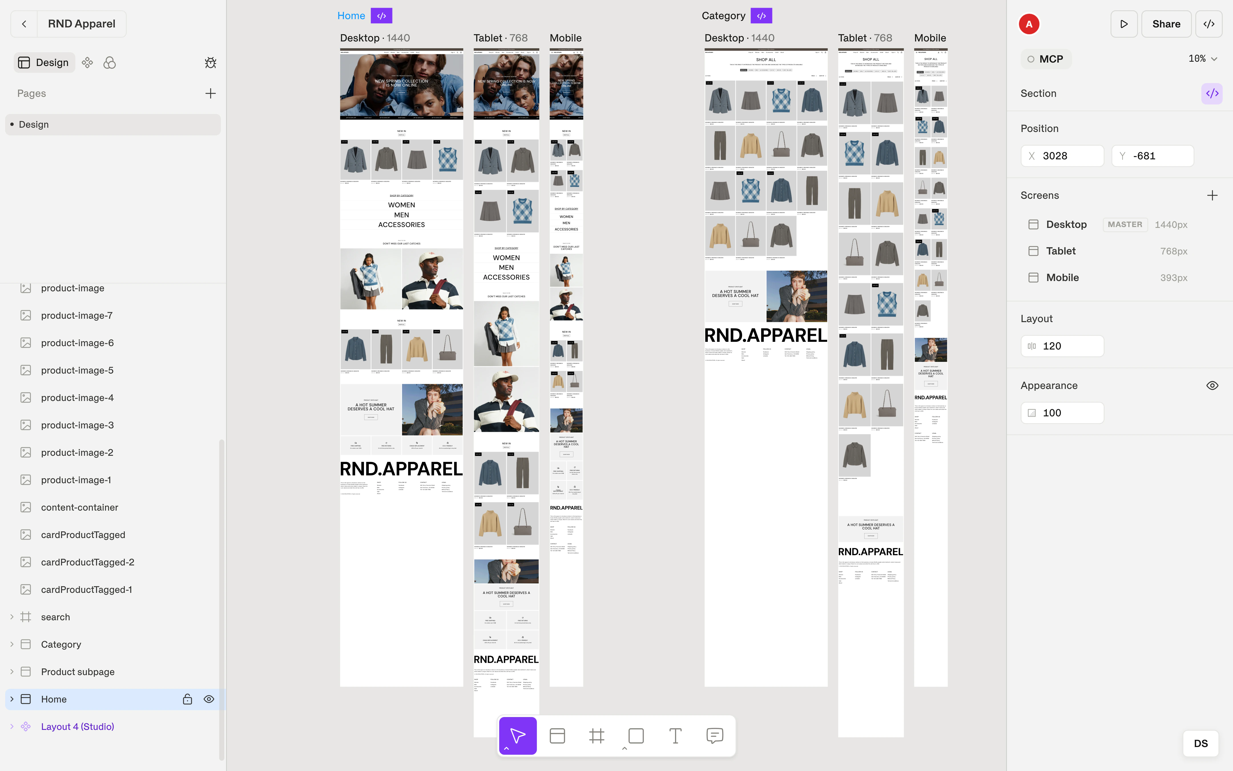
To add another version of a page, select the section, click Add screen and choose a breakpoint or a custom width. The screens share structure and components, and you adjust the layout for each width. Shippp starts with Mobile, Tablet and Desktop breakpoints, and you can rename them, change their widths and use up to five.
When a section is ready, click Select for dev. It becomes the default in the export and visible to AI clients over MCP. You can undo the marking at any time.
Screens & breakpointsSmart layout
Select a container and press ⌘ G, or choose Smart Layout from the context menu. Then pick how its children are arranged: Vertical, Horizontal or Grid. Vertical and Horizontal correspond to a flexbox column and row, Horizontal can wrap, and Grid lets you define columns and rows with the Grid tracks editor. Free turns smart layout off and lets you place children by hand.
Set the gap, the padding and the alignment on a 3 × 3 grid. Then choose how each child sizes itself: Fill container takes the space its parent gives it, Hug contents wraps its content and Fixed keeps an exact size. Gap, padding and size can bind to tokens, so spacing stays consistent across breakpoints.
Some layers shouldn't follow the layout, such as a floating badge. Use Ignore smart layout to take a layer out of the flow and Rejoin smart layout to put it back.
Smart layoutText and typography
Press T and click to add text, or drag to create a box with a fixed width. Double-click or press Enter to edit, and select part of the text to style a single run.
The Typography section covers font family, weight, style and size, line height, letter spacing, alignment and text resizing. Open More text options for decoration, text case, truncation with an ellipsis, a maximum number of lines and OpenType features. For line breaks, we suggest Balance for headings and Pretty for paragraphs, which avoids single words on the last line.
You can choose fonts from the file, from Google Fonts, from system fonts or from your device. Google Fonts export automatically. Device fonts need Chrome or Edge on desktop, and Shippp warns you when a font won't be available elsewhere.
Text & typographyImages, icons and assets
Drag an image onto the canvas, paste it from the clipboard or use it as a fill. In the Image section you can crop and reposition it, set how it fits its box, choose a focus point and replace the file while keeping its size, crop and position.
Add alt text to each image. It exports for screen readers and search engines.
For icons, paste SVG code or drag in an .svg file to get a vector layer. Recolor it with Icon fill, Icon border or Selection colors, and bind the colors to tokens. Turn icons you use often into components, then change them on an instance with Swap icon. Gradients and effects such as drop shadows, inner shadows and blurs work on any layer.
Tokens
Tokens have two layers. Primitive tokens hold raw values, such as gray-900 = #1a1a1a or space-6 = 24. Semantic tokens give those values a role by pointing to a primitive, such as Text/Primary → gray-900. You keep the palette in one place and change roles without touching it.
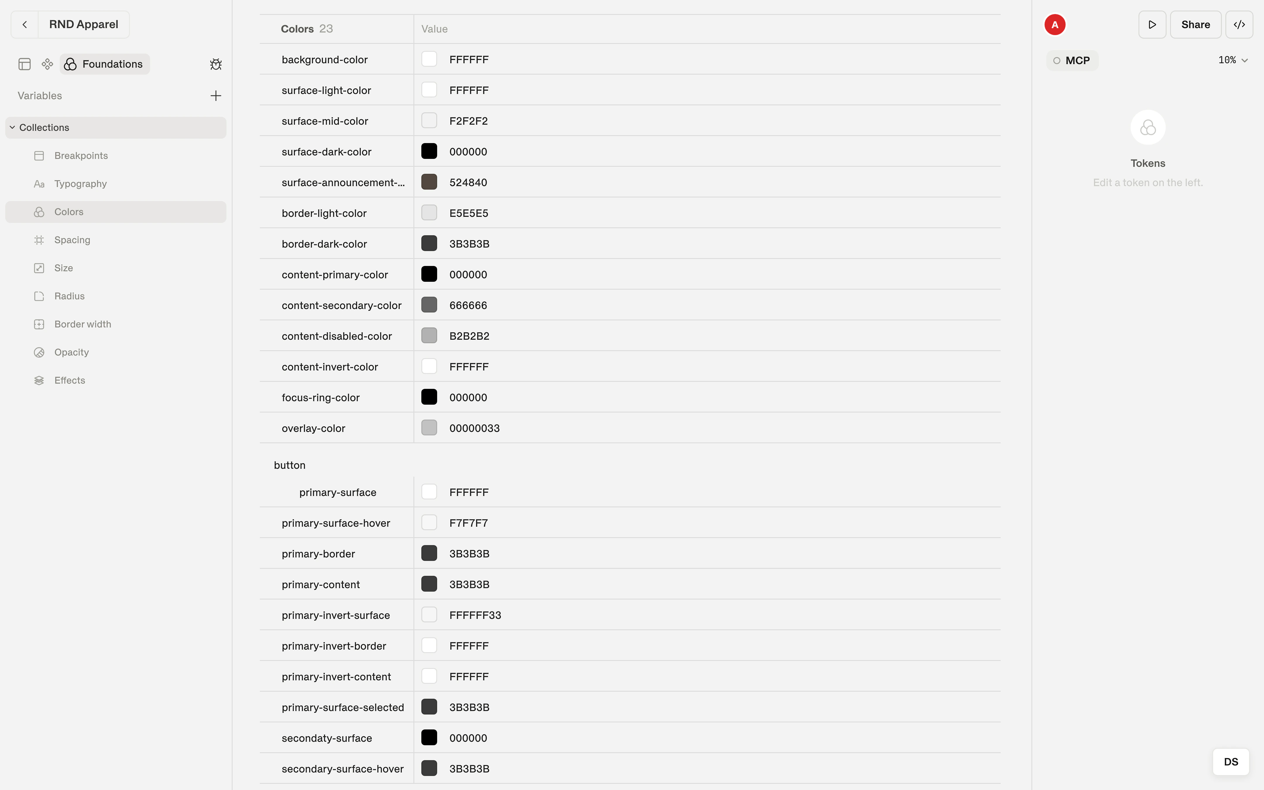
Semantic tokens cover nine categories: breakpoints, typography, colors, spacing, size, radius, border width, opacity and effects. Create primitives in Foundations, or use Create token straight from a color picker. Colors, gap, padding and size can then bind to the tokens in the picker.
Turn on Enable per-breakpoint and a token holds one value per breakpoint. A spacing token can be 24 px on Mobile, 40 px on Tablet and 96 px on Desktop. On export, the code keeps your token names, and responsive tokens become theme objects with a value for each breakpoint.
TokensText styles
A text style saves font, size, line height and letter spacing under one name. Style a text layer, save it from the Typography menu as, say, Heading 1, and apply it to any other text. Edit the style and every use follows. You can also manage all styles as a table in Foundations → Typography.
Text styles can be responsive. Enable per-breakpoint and one style holds different values for each breakpoint, such as 48 px on Desktop and 32 px on Mobile. In code, that becomes one style with a value per breakpoint.
We recommend naming styles by role, such as Heading 1, Body and Caption, because sizes change and roles don't. Text styles cover typography only, so set the text color with a color token.
Text stylesComponents and variants
A component has three parts: the main component, where you design it, the Studio, which shows every variant, and the instances you place on screens. Build the design with smart layout and tokens first, then right-click and choose Create Component.
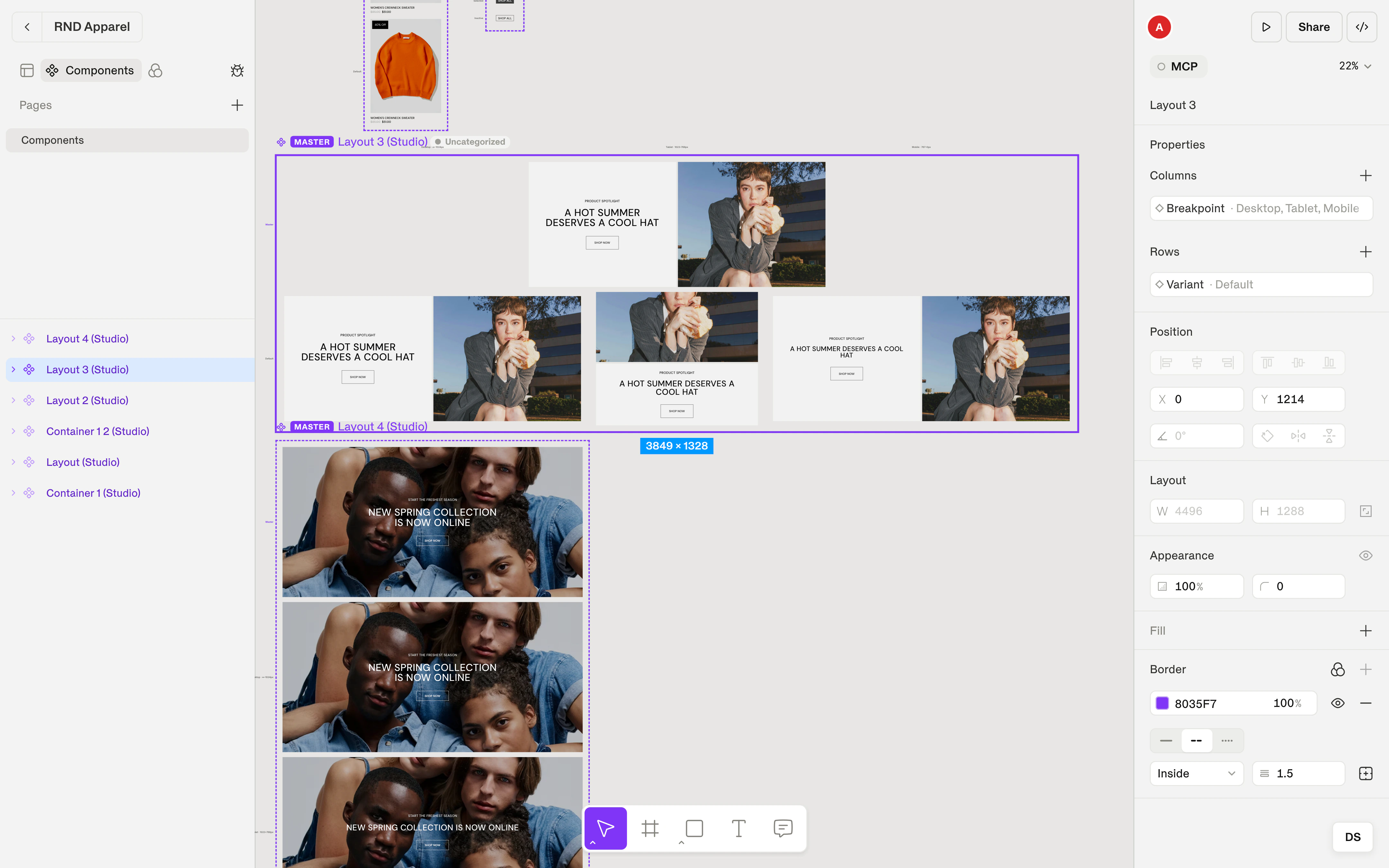
Add properties in the inspector, such as Variant with the values Primary, Secondary and Ghost. Each combination of values is a variant, and the Studio lays them out as a grid so you see all of them at once. Hover, focus and disabled are states, and they export as real interaction states, not as ordinary variants.
On a screen, an instance follows its main component. You can choose variant values, override what you need (overrides are marked with a dot), swap the component or eject the instance to detach it. Properties become typed props in the exported React component, and layer names become slot names, so name your layers with that in mind.
Every export includes Storybook stories for each variant, state, breakpoint and swap combination, so you can check the code against the design.
Components & variantsStart designing
Open Shippp, start a file and build something small. If you want a guided first run, the Quickstart takes you through it. Then tell us how it went.