
How breakpoints work in Shippp
In Shippp you design one screen and let the others inherit from it. You change only what needs to differ at each width.
Bence
Co-founder
If you have designed responsive pages before, you probably worked with one artboard per device: a Desktop frame, a Tablet frame, a Mobile frame. When the headline changed, you changed it three times.
Shippp works differently. The first screen of a page is the master. The screens after it follow the master, and you override only what needs to look different. This article explains how that works.
A section holds one page
Press S and click on the canvas to add a screen. A section groups the screens of one page. Select the section, click Add screen and choose a breakpoint or a custom width to add another screen.
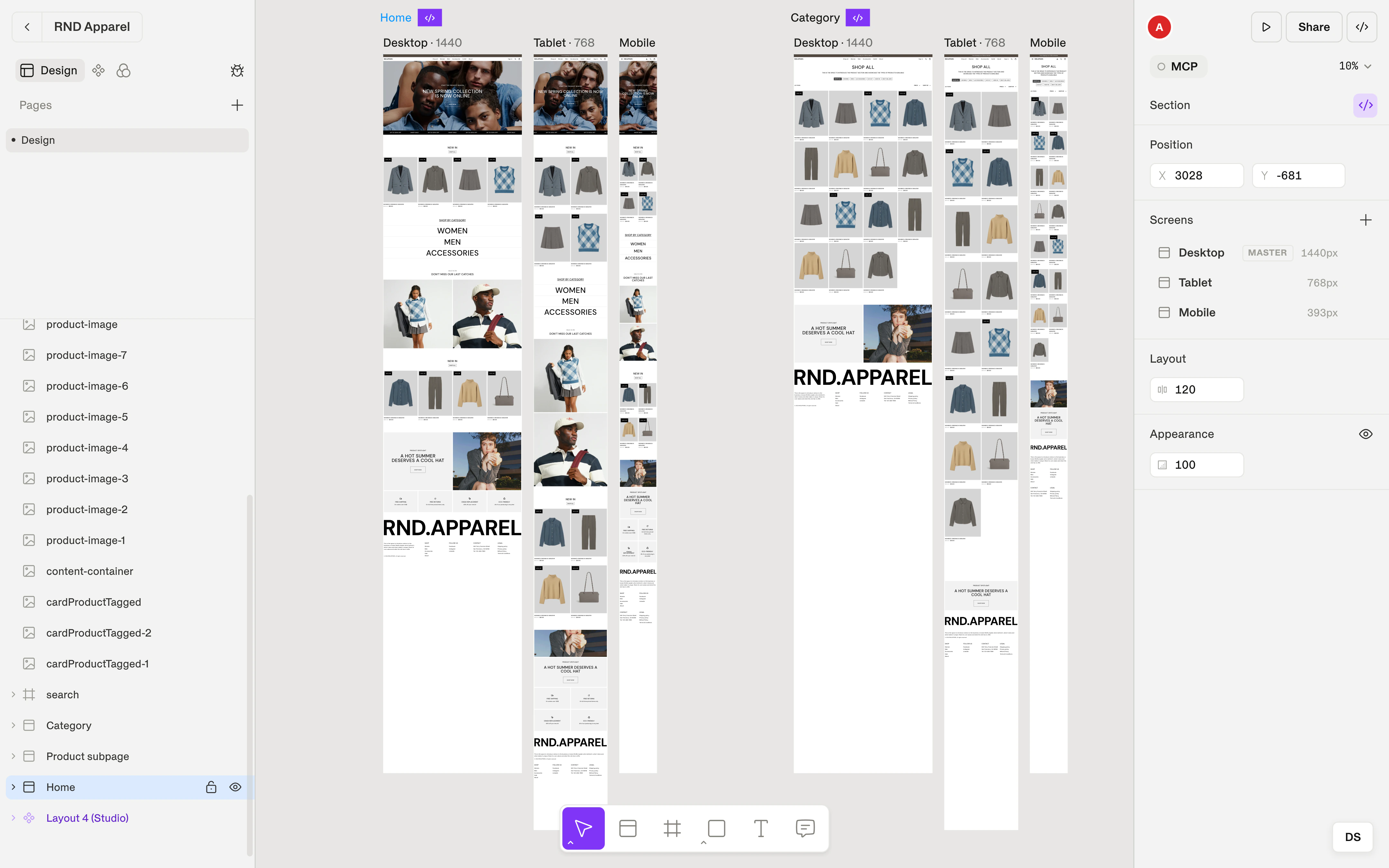
Each screen title shows its breakpoint and width, for example Tablet · 768.
Shippp starts with three breakpoints: Mobile, Tablet and Desktop. You can rename them, change their widths and use up to 5.
The first screen is the master
The first screen in a section is the master screen. Design your page there: the structure, the content, the styling.
Every screen you add after it inherits from the master. A new screen starts as a faithful version of the master at its own width, so it looks right without any work from you.
Because the followers inherit, a change on the master reaches all of them. Change a heading color on the master and every other screen shows the new color.
Overrides: changes on the other screens
When you change something on a screen after the master, that change is an override. It applies to that screen only.
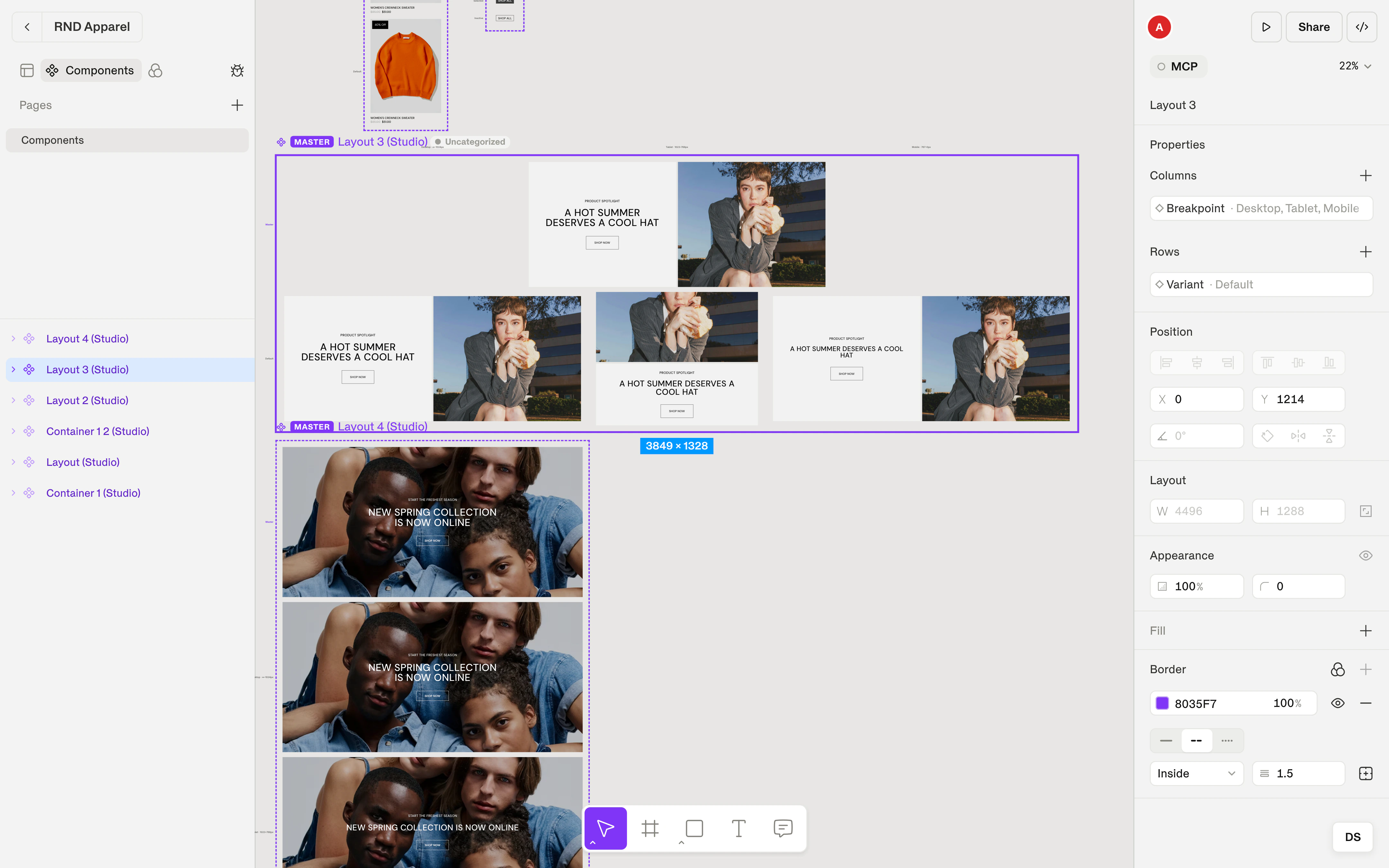
Say a heading is 48 px on the master and should be 32 px on the Mobile screen. Open the Mobile screen, select the heading and set the size to 32. The master keeps 48, and so does every other screen.
You can override any property: size, padding, gap, layout direction, alignment, visibility. Change Horizontal to Vertical on Mobile to stack a row of cards. Set a card to Fill container on Mobile while the master keeps Fixed. Hide a decorative image on Mobile only.
Screens inherit from the master, not from each other
Every screen follows the master directly. An override on Tablet doesn't reach Mobile, and an override on Mobile doesn't reach Tablet.
This makes the model safe to work in. You can restyle the Mobile screen heavily and know that no other screen changes. You don't have to check the other views after each edit.
See what you overrode
When a property differs from the master, a small dot appears next to its field. It means: this value was set here, and no longer follows the master.
Click the dot to reset the property. It goes back to following the master, and the override disappears.
Use the dots as a checklist. Select a layer on the Mobile screen and look for dots. They show you exactly how that layer differs from the master.
What happens when the master changes
Properties you haven't overridden keep following the master. If you change the master's gap from 24 to 32, every screen without its own gap override moves to 32.
Properties you have overridden stay as you set them. The master no longer controls them until you reset the override.
Breakpoints are tokens
Breakpoints live in Foundations as tokens, next to your colors and spacing. Each token holds a name and a width, and each screen takes its breakpoint from them.
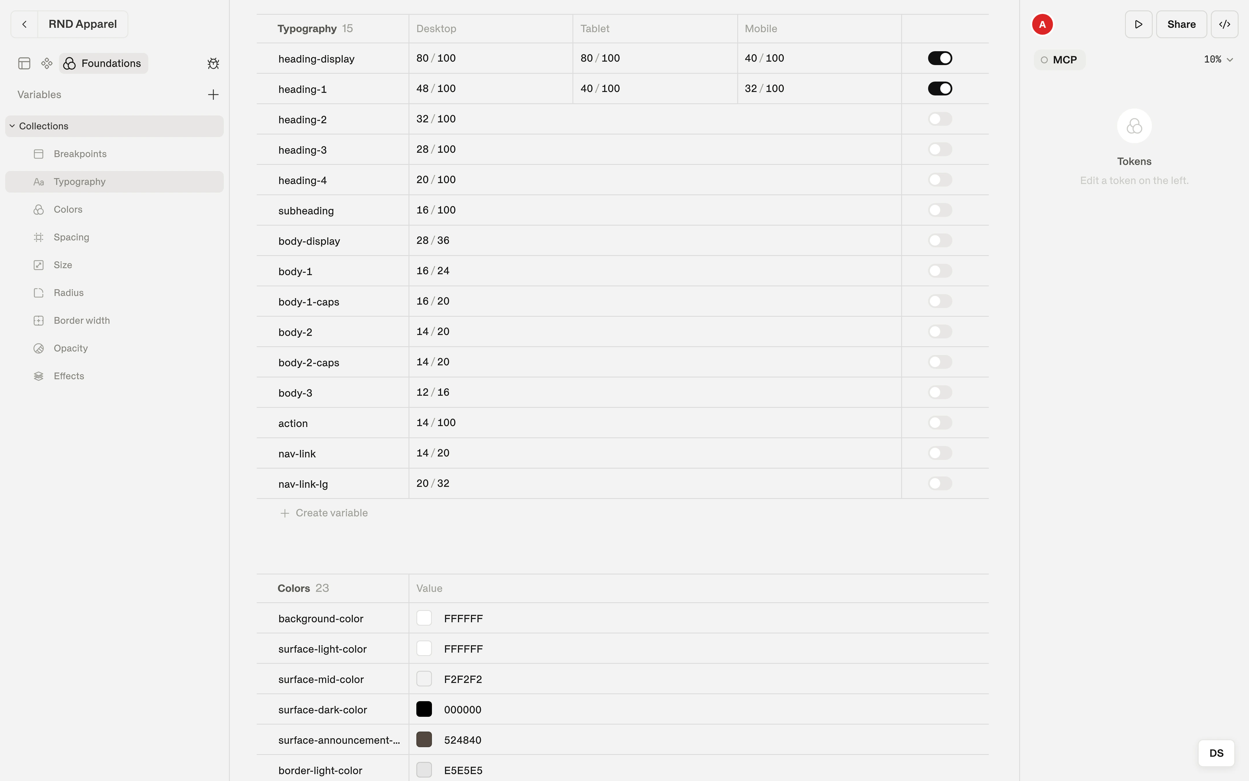
Semantic tokens and text styles also have a breakpoint ribbon in their editor. By default the views are linked, and the value is the same everywhere. Double-click a breakpoint on the ribbon to unlink it, then click a breakpoint to switch views and give it its own value. Double-click again to link it back. When you link, the value you see in the active view becomes the single shared value.
This is how a type scale gets smaller on Mobile without touching a single layer. Set the heading text style to 32 px on Mobile and 48 px on Desktop, and every heading follows.
What you get in code
The breakpoints you design are the breakpoints in the export. Overrides become the responsive styles of the exported component. The preview and the Storybook stories show the breakpoint that matches the viewport, and they match what you saw on the canvas.
You don't hand over a set of mockups to be reinterpreted. The behavior is in the file.
A workflow that works
- Design the master screen completely: structure, content, styling.
- Add a screen for each breakpoint you need. Don't adjust anything yet.
- Go through the screens one by one. Fix only what breaks at that width: stack a row, shrink a heading, hide a decoration.
- Check the dots on the layers you changed. Reset any override you no longer need.
- Move repeated choices into tokens and text styles, and let them handle the breakpoint differences.
- Click Select for dev on the section when it is ready.
Coming from one frame per device
| If you are used to | In Shippp |
|---|---|
| One artboard per device | One section with a master screen and its followers |
| Copying a change to each artboard | Changing the master once |
| A different layout on mobile | An override on the Mobile screen |
| Checking each artboard for drift | Looking for dots on the layer |
| Device sizes | Breakpoints you name and set yourself, up to 5 |